How to Read a Histogram: Essential Techniques for Data Analysis in 2025
Histograms serve as a vital tool for data analysis, enabling observers to visualize frequency distributions effectively. As data continues to proliferate, understanding histograms will be crucial for 2025 and beyond. This article will delve into how to read a histogram, equipping you with essential techniques and insights for better interpretation and analysis of data distributions. Whether you are a statistician, researcher, or an enthusiast looking to enhance your data literacy, mastering histogram basics is imperative.
Understanding Histograms: An Overview
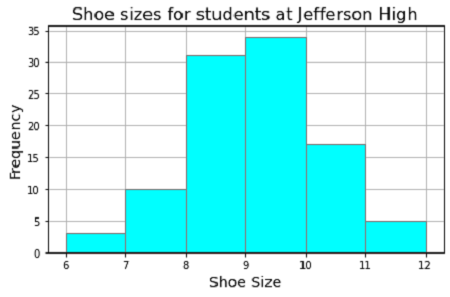
Histograms represent the distribution of numerical data, enabling a visual interpretation of how often values occur within certain ranges. A good understanding of a histogram’s structure is key to interpreting its data accurately. Typically, the data is divided into bins, which aggregate ranges of values into bars. These bars’ heights correspond with the frequency of data points that fall within each interval, providing a clear visualization of data dispersion. Understanding histograms allows users to identify patterns, anomalies, and underlying trends within datasets.
Histogram Structure Explained
The histogram structure is composed of several critical components that collectively convey essential information. Each axis plays a significant role; the x-axis represents the bins while the y-axis indicates the frequency or count of data points within those bins. Consequently, a careful examination of the histogram axes is vital for interpreting outcomes accurately. Additionally, characteristics such as bin width and range impact how closely data details are analyzed. A well-structured histogram can resonate insights regarding the shape and spread of the data, aiding in drawing precise conclusions.
Types of Histograms and Their Uses
Various types of histograms exist, each serving unique purposes in data analysis. For instance, a relative frequency histogram offers insights into proportions rather than counts, granting a more nuanced perception of distribution trends. Another type, the cumulative histogram, represents accumulated frequencies, useful for assessing the distribution’s impact beyond individual categories. Finally, advanced analysis may require exploring cumulative frequency as well. Distinguishing between these types enhances overall histogram understanding and encourages better application in scenarios such as research, business analytics, or educational environments.
Histogram Interpretation: Techniques for Clarity
Effective histogram interpretation requires the mastery of specific techniques. By honing skills in reading various histogram features, analysts can glean data-driven insights efficiently. Begin with careful examination of the histogram shape. Different shapes, such as normal distributions or skewed metrics, can drastically alter data interpretation. Recognizing patterns like histogram skewness informs whether data are uniformly distributed or exhibit strains or biases.
Analyzing Histogram Frequencies
Understanding histogram frequencies allows for granular data storytelling. By analyzing the height of each bar, analysts can discern which intervals hold the most data points. This aids in pinpointing modes, identifying central tendencies, and foreshadowing data trends. Ironically, the simplest-looking histograms often contain the most significant insights. Implement frequency distributions effectively to examine which clusters or outlier values may impact overall conclusions.
Comparing and Contrasting Histograms
Learning how to compare histograms opens up pathways to discernible insights. Being skilled at comparing histograms involves reviewing multiple distributions to identify differences in shape, spread, and centrality. Visualizing this data clearly enables users to track changes across different conditions or over time. For instance, side-by-side visualizations of competing products can illuminate customer preferences and highlight market trends. Setting up effective histogram comparisons can significantly bolster analytical outcomes.
Practical Applications of Histograms in Data Analysis
Histograms are useful far beyond the classroom or theoretical applications; they provide a framework for exploring real-life data challenges. Engaging in histogram applications reinforces analytical capabilities across sectors such as business, education, and healthcare. Whether creating dashboards or report visuals, histogram representation transforms dry data tables into compelling stories that can effectively influence decision-making processes.
Creating a Histogram: Step-by-Step Guide
Creating a histogram requires understanding the data and selecting appropriate visualization methods. Follow these steps to ensure accuracy in your results: First, gather your data and determine meaningful ranges for your bins. Next, calculate the frequency of data points falling into each bin before drawing bars accordingly. Lastly, ensure to label your histogram labels clearly, specifying what each axis represents, to enhance comprehension. Using tools like Excel or dedicated data analysis software can streamline this process significantly.
Interpreting Changes in Histogram Patterns
Analyzing changes in histogram patterns over time reveals progress and impacts. For example, comparing pre- and post-intervention data, such as health metrics before and after introducing a fitness program, provides insightful evaluations of effectiveness. Observing shifts in distribution shapes can alter strategic choices and inform program adjustments. Nonetheless, continual refinements in histogram interpretation strategies deepen understanding and control in decision-making processes.
Key Takeaways
- Histograms are pivotal for visualizing data distributions and insights.
- Understanding histogram structure is essential for impactful analysis.
- Master techniques for interpreting shapes and frequencies to derive insights.
- Creating histograms accurately is crucial and enhances data storytelling.
- Apply histogram comparisons effectively to drive analytical insights.
FAQ
1. What is a histogram and how is it used?
A histogram is a graphical representation of frequency distributions that shows how data is distributed across certain ranges, providing visual insight into data patterns and behaviors. This data representation tool aids in analyzing the distribution’s shape, spread, and insights into anomalies.
2. How do I create an effective histogram?
Creating an effective histogram involves choosing proper bin widths, accurately calculating frequencies for each range, and ensuring clear labeling. Software tools are available for this process, simplifying construction and enhancing data visualization.
3. What are some common types of histograms?
Common types of histograms include frequency histograms, cumulative frequency histograms, and relative frequency histograms, each providing distinct insights about distributions and trends in the underlying data.
4. How can I compare different histograms?
To compare histograms, align similar metrics or categories visually, looking for differences in shape, spread, and frequency counts. Overlaying or arranging histograms side by side can enhance comparisons effectively.
5. Why is understanding histogram skewness important?
Understanding histogram skewness is essential to identify potential biases in data distribution. Recognizing if a distribution is left or right-skewed informs analyses, decisions, and appropriate responses to data observations.
6. How can histograms aid in data storytelling?
Histograms help in data storytelling by transforming complex datasets into clear visuals that highlight trends and patterns. This clarity assists in engaging decision-makers and conveying crucial insights derived from data closely.
7. What advanced techniques can enhance histogram reading?
Advanced techniques in histogram reading include exploring bin width adjustments, analyzing combined histograms for multiple datasets, and incorporating statistical overlays like mean or median lines for deeper insights into distributions.